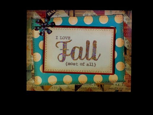
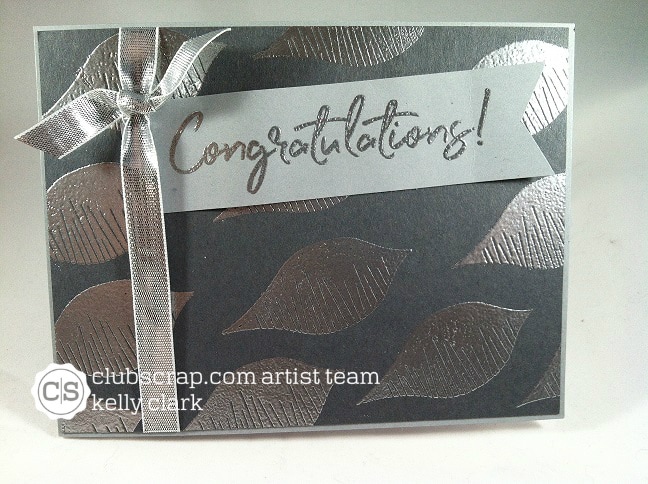
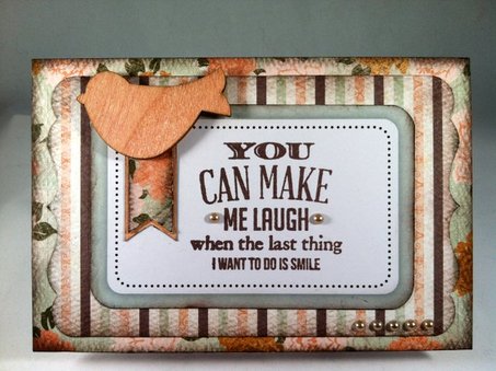
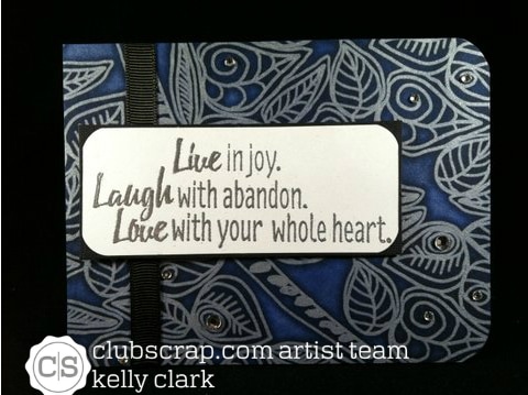
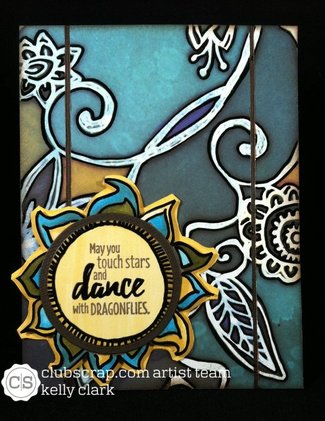
There's something about this card that is comfortable like an old sweater. The sentiment comes from The Project Bin's "New Leaf" set, and is embellished with some really pretty Stickles.
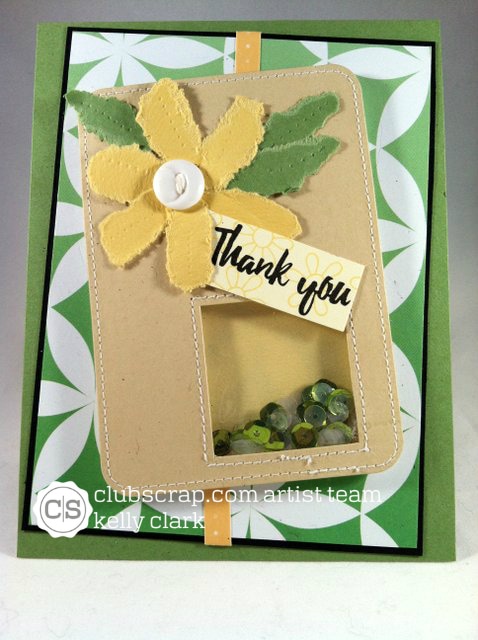
I sponged the edges of the base card, the polka dot paper, and the sentiment panel. The double-stitched die I used comes from Gina Marie Designs.
And now, it's off to find an old sweater to get comfortable in...
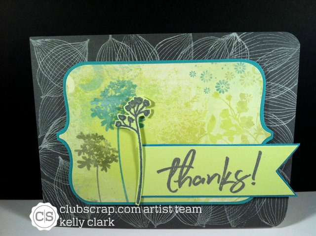
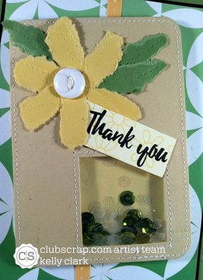
I sponged the edges of the base card, the polka dot paper, and the sentiment panel. The double-stitched die I used comes from Gina Marie Designs.
And now, it's off to find an old sweater to get comfortable in...


 RSS Feed
