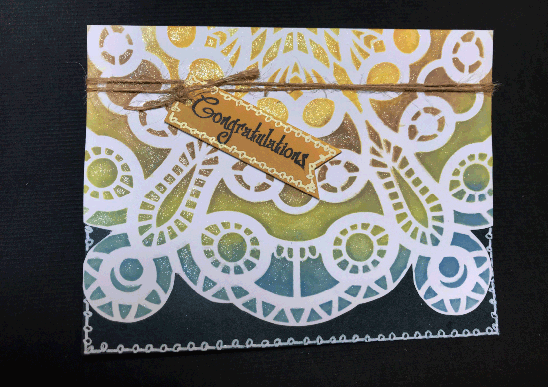
After a wild ride learning how to use a stencil, I made this card using a sentiment from Creative Vision Stamps' "Simply Said" set. I was going for a 70's vibe with my color choices and added some of my speciality "tatting" around the bottom area.
0 Comments
Welcome, Stampers, Scrapbookers, and all other ilk of crafters! (That might be redundant, but I don't use the word "ilk" very often, so . . .) You've probably landed here after visiting Donna's Hawthorn Hill blog, and I'm the last stop of the hop. If not, and you want to start at the beginning, click here where you can also get a look at hop list. I'm so glad you stopped by! I made a few cards I really like - I can't always say that - and am excited to share them with you. Yeah, yeah, I know they're succulents, but they're also faux roses, right? Right. (Work with me here, people; work with me!) I assembled the card base by adding the dark panel on top of a white card base. I ran the front cover through the Big Shot one hundred and seventeen times to get the die through all the layers. Next, I stamped the Happy Birthday sentiment, embossed it, and layered the panel onto a contrasting panel and popped a faux metal enamel dot from the "Color Me Happy" kit from last month. I went back to the card base and added white gel pen accents on the darkest card stock, socked in the "roses," added glitter, and popped up the one in the center, and attached the sentiment. Lastly, I added a strip of patterned paper from one of the cut-aparts on the bottom edge to accent the scalloped edge. DONE! Nope, not yet. Something's amiss. What is it? Oh, I know, add a border using that cool technique I "invented" a week ago or so~ I used my Sakura Glaze pen so it's shiny and raised. Just what it needed!
This card is really simple to make and you have all the required items to make one like it in your house RIGHT NOW! I watched the following video to make sure the idea that was in my head would actually work. Super-duper easy but looks like a big deal. (It'll be our little secret!) I distressed the patterned paper on the front of the card. Ran scissors along the edges, rolled the edges with my fingernails, chewed on the edges a little to give it a stranded-without-food-on-a-deserted-island-so-this'll-have-to-do appearance. Moderately effective and the cardstock didn't taste nearly as awful as I expected. (Or if you want the distressed look without all the hassle, wait to cut cardstock until 30 minutes before a deadline. Without fail, your trimmer blade will be as dull as a bread knife and shred the edges for you!) I matted it and added it to the front of the card. I added a bow that took on a life of its own, but by that time, is was waaaay too late to turn back. Finally, I tucked the sentiment onto the front. Inside, I added a strip from one of the cut-aparts at the top and bottom of the card to give it a finished look. Oh, and there were those things that stand up. The letters were from my stash and the plastic came from something I dragged out of the trash. Recycling at its finest! Some things to note: 1. The width can be whatever you want it to be, but that 2" extra on the length is a must to make sure your pop-ups have enough cardstock to grab onto at the base. 2. Most of the beautiful papers we get from Club Scrap are quite thick. Scoring the cardstock to make the interior folds was challenging. If you plan on mailing a card made with this pattern and Club Scrap papers, be ready to pay extra . . . It's quite bulky! 3. You can pretty much squeeze anything onto those clear strips, just bear in mind the heavier the items, the thicker the clear strips need to be I am the official tail end of this hop. If you want to start over again, click the "next up" button to go back to Karen at Club Scrap. Thanks for dropping by today; I hope you'll come by again!
Mom "graduated" on Sunday from the three-year Episcopalian religion course she was taking. Since the event necessitated a new outfit, I thought it also called for a congratulations card. I got to use my favorite stamping tool - my ink spritzer - which hadn't seen the light of day since I got my Copics! The set was from the 2015 Stampin' Up! Occasions catalog and is called Cheerful Critters.
My favorite part of the card is the hair on the bear! It doesn't really look "natural" to me, but I think it goes well with the cartoony image. I'm kind of cartoony in my own way, and believe it or not, that hair looks just like the hair on my sweather-weather legs! Yay, Mom! |
It's Just Me!Librarian, crafter, pet mom, and thrift store shopper who can fritter a day away like nobody else. Well, except for you maybe. Let's be friends!
SCRAPLIFTING & CARDJACKINGAll content included on Serendipity & Whimsy is COPYRIGHT ©Kelly A. Clark.This artwork is shared for your personal inspiration and enjoyment only and may not be used for publication, submissions, or design contests.
Design Team ExperienceArchives
July 2020
Categories
All
|