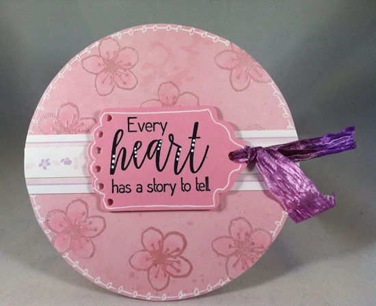
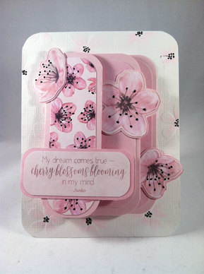
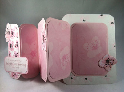
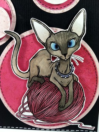
This is the last of the "Cherry Blossom" cards for this go around. I have lots of paper left to make more, though, so there will be more in the future!
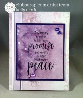
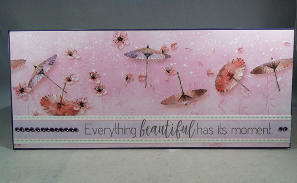
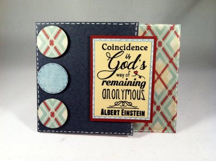
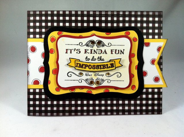
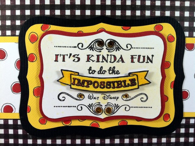
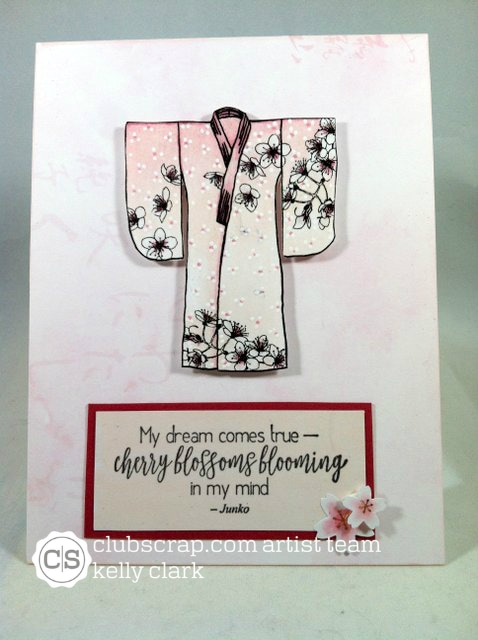
This card uses papers and cut-aparts from the kit. I added three flower sequins to finish off the card and like the way it looks. Clean and "professional!"
This card uses papers and cut-aparts from the kit. I added three flower sequins to finish off the card and like the way it looks. Clean and "professional!"
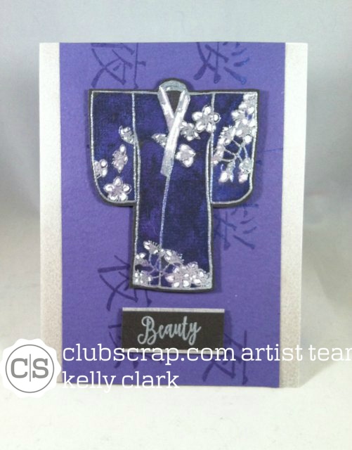 | 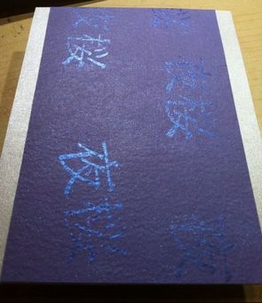 |
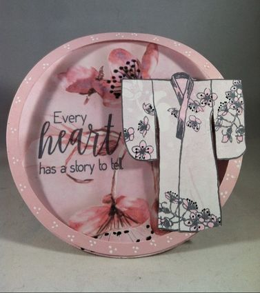
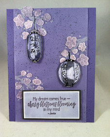
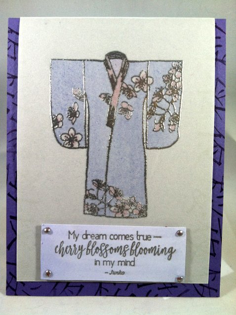
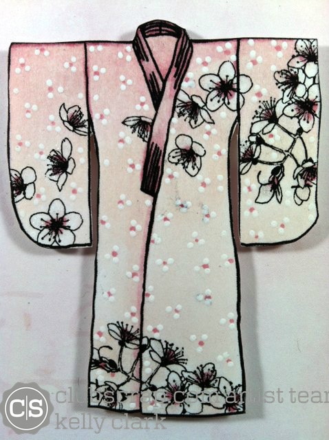
Here is another of those cards that you can't get a feel for the nuanced elements. Both the kimono and the jacket have been "painted" with Pearl Ex. I also added white gel pen to the flowers. You can see how the Pearl Ex looks from the second photo, where the kanji glows.
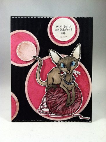
I'll be sad to see this kit go and look forward to "going back for seconds" in the future!
I'll be sad to see this kit go and look forward to "going back for seconds" in the future!


 RSS Feed
